<view class="outerView">
    <view class="innerView1"></view>
    <view class="innerView2"></view>
    <view class="innerView3"></view>
<view>
.outerView{
    width:100%;height: 100px;margin: 0 auto;background-color: brown;
}
.innerView1{
    width: 40%;height: 40px;background: blue;display: inline-block;
}
.innerView2{
    width: 40%;height: 40px;background: yellow;display: inline-block;
}
.innerView3{
    width: 40%;height: 40px;background: peru;
}
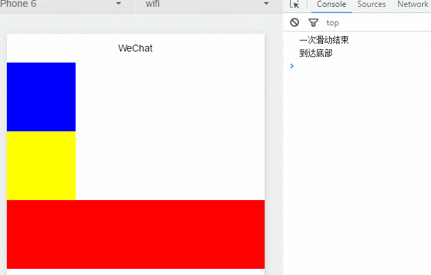
<view class="section">
    <scroll-view scroll-y="true" style="height: 200px;" bindscrolltoupper="upper"
     bindscrolltolower="lower" bindscroll="scroll" lower-threshold="50"  scroll-into-view="{{toView}}"
      scroll-top="1000px">
        <view id="green" class="scroll-view-item bc_green" style="width:100px;height:100px;background:red"></view>
        <view id="red"  class="scroll-view-item bc_red" style="width:100px;height:100px;background:blue"></view>
        <view id="yellow" class="scroll-view-item bc_yellow" style="width:100px;height:100px;background:yellow"></view>
    </scroll-view>
</view>
<view class="section section_gap">
    <scroll-view class="scroll-view_H" scroll-x="true" style=" white-space: nowrap" >
        <view id="green" style="width:400px;height:100px;background:red;display: inline-block"></view>
        <view id="red"  style="width:400px;height:100px;background:blue;display: inline-block"></view>
    </scroll-view>
</view>
<!--indicator-dots是否显示圆点,autoplay自动播放,current初始显示的item(0代表第一个item), duration滑动速度, bindchange监听滚动和点击事件,interval滑动间隔时间-->
<swiper indicator-dots="true" autoplay="true" current="1" duration="1000" bindchange="listenSwiper" interval="2000">
<!--swiper-item只能包含一个节点再多会自动删除-->

    <swiper-item>
        <view style="height: 150px"><image src="../../pic/pic2.png" style="width:100%;height:100%"/></view>
    </swiper-item>
    <swiper-item>
         <view style="height: 150px"><image src="../../pic/pic1.png" style="width:100%;height:100%;"/>
         </view>
    </swiper-item>
     <swiper-item>
          <view style="height: 150px"><image src="../../pic/pic3.png"  style="width:100%;height:100%;"/>
          </view>
    </swiper-item>
</swiper>

<!-- type=[ 'success', 'info', 'warn', 'waiting', 'safe_success', 'safe_warn',
'success_circle', 'success_no_circle', 'waiting_circle', 'circle', 'download',
'info_circle', 'cancel', 'search', 'clear'] -->
<icon type="success" size="23" color="red"/>
<view><text>可以长按选中</text></view>
<!-- percent:百分比,active:是否显示从左往右的动画(但是经过测试无论设置为true还是false动画都会显示,去掉该属性则不显示动画),showInfo:是否显示百分比,strokeWidth:进度条宽度 -->
<progress percent="100" active="false" showInfo="true" strokeWidth="7" />
<!-- type:[primary, default, warn],size:[default,mini],loading:按钮前是否带loading图标,plain:按钮是否镂空,disabled:是否生效,formType:[submit,reset],hover-class:按下时的样式类名 -->
<button type="warn" size="mini" loading="true" plain="true" disabled="true" bindtap="default" formType="reset" hover-class="none"> default </button>
<!-- disabled:不可选中,value:当value改变时触发bindchange绑定的函数 -->
<checkbox-group bindchange="checkboxChange">
    <label class="checkbox" wx:for-items="{{[1,2,3,4,5]}}">
        <checkbox value="{{item}}" checked='false' disabled="true"/>{{item}}
    </label>
</checkbox-group>

<input placeholder="禁用了的input" value="禁用了的input" type="text" auto-focus/>

<radio-group bindchange="test">
    <label class="radio" wx:for-items="{{[1,2,3,4]}}">
        <radio value="{{item}}" checked="true"/>{{item}}
    </label>
</radio-group>

<!-- disabled:禁用无法滑动,step:步长如果设置为2则显示value为50 52 54...
     show-value:是否显示当前值
 -->
<slider bindchange="test" min="50" max="200" show-value step="2"/>

<!-- type:[checkbox,switch]两种样式,disabled,checked -->
<switch checked="true" bindchange="test" type="checkbox"/>
<switch checked="true" bindchange="test" type="switch"/>