正文
开始学习微信小程序时,需要掌握最基本的UI布局,有了UI的布局才是一个开始。下面主要通过一些例子来聊聊FlexBox布局,其实它和ReactNative大同小异。所以学习一门技术,其它的也就不愁了。下面主要通过一些例子来说明FlexBox是如何布局的。
FlexBox概述
-
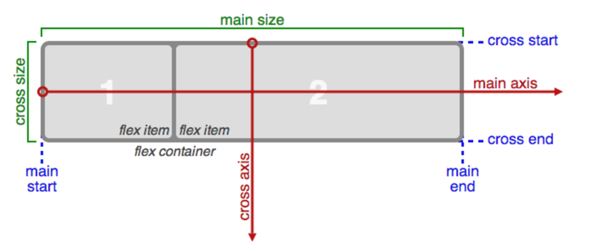
Flex container(容器)
承载子视图的一个容器,也就是说一个视图,如果设置成display: flex;,那么它就是作为一个Flex container。其中它的子视图,称为FlexItem。
-
主轴(Main axis):
主轴也就是水平轴,它决定了Flex item的布局的方向。也就是子视图的布局方向是从水平方向开始。
-
main-start | main-end
主轴的起点和结束点。
-
main size
Flex container占主轴的空间。
-
纵轴(cross axis)
垂直于主轴的轴成为纵轴,也叫交叉轴。
-
cross-start | cross-end
纵轴的起点和结束点。
-
cross size
Flex container占纵轴的空间。
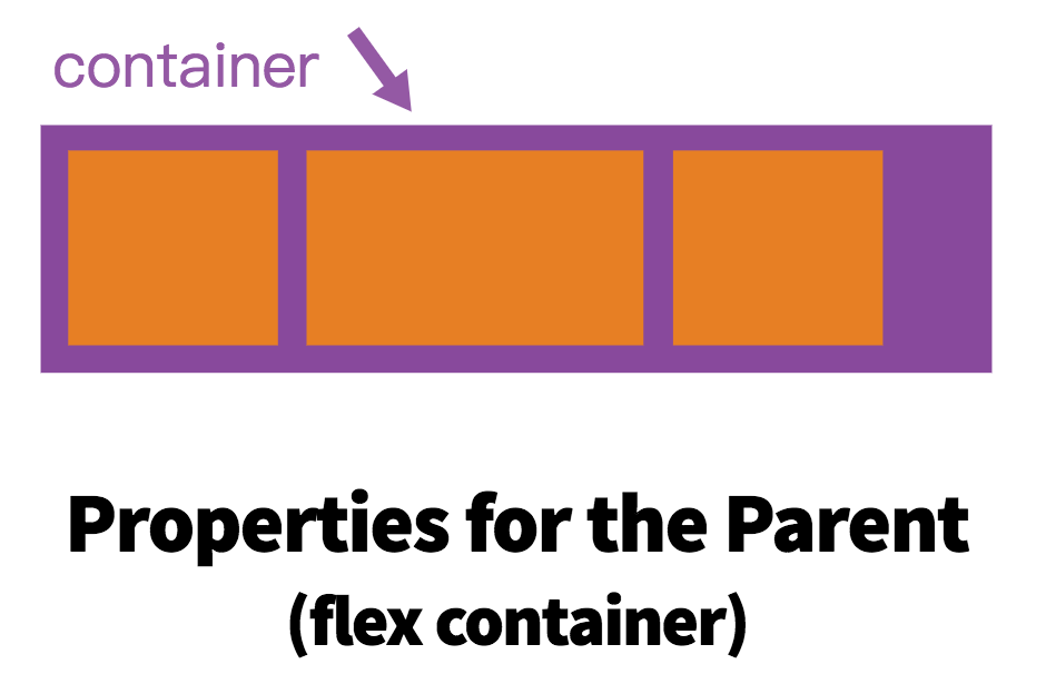
一、容器属性介绍
-
display:flex
如果想采用FlexBox布局,必须设置 .container { display: flex; },这样这个视图将作为一个Flex container。
-
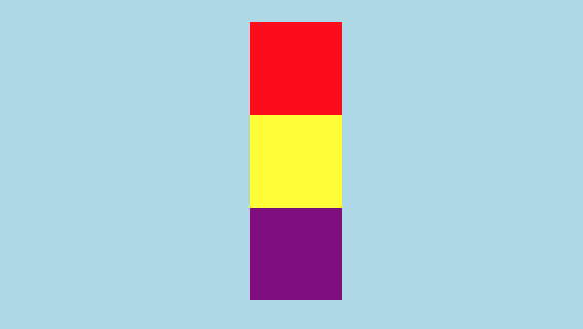
flex-direction:row | row-reverse | column | column-reverse;
它决定了子视图的布局方向,默认的布局方向是row。
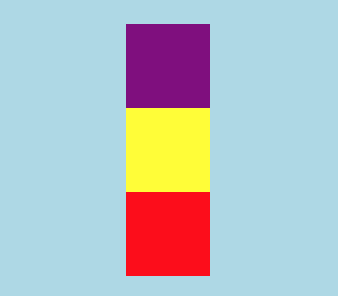
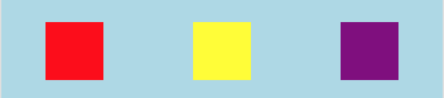
me.wxml文件
<view class="container">
  <view class="children1"></view>
  <view class="children2"></view>
  <view class="children3"></view>
</view>
me.wxss文件
.container {
  display: flex;
  background-color: lightblue;
}
.children1 {
  width: 100rpx;
  height: 100rpx;
  background-color: red;
}
.children2 {
  width: 100rpx;
  height: 100rpx;
  background-color: yellow;
}
.children3 {
  width: 100rpx;
  height: 100rpx;
  background-color: purple;
}
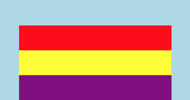
flex-direction:column,垂直方向布局,从上到下布局
flex-direction: column-reverse;,垂直方向布局,从下到上布局
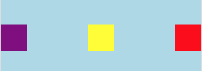
flex-direction: row;,默认,水平方向布局,从左到右布局
.container {
    display: flex;
    flex-direction: row;
    background-color: lightblue;
}
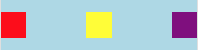
flex-direction: row-reverse;,水平方向布局,从右到左布局
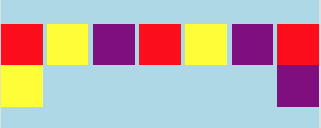
.container {
    display: flex;
    flex-direction: row;
    flex-wrap: wrap;
    background-color: lightblue;
}
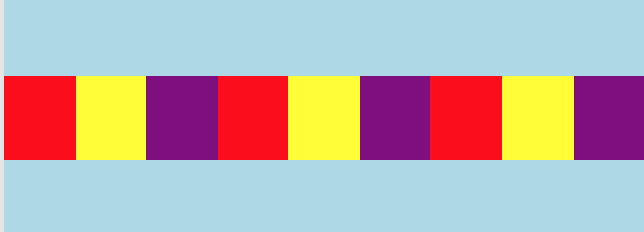
.container {
    display: flex;
    flex-flow: row wrap;
    justify-content: space-around;
    background-color: lightblue;
}
.container {
    display: flex;
    flex-flow: row wrap;
    justify-content: space-between;
    background-color: lightblue;
}
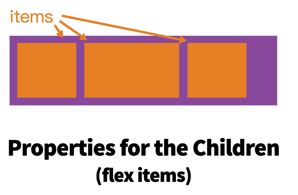
二、Flex item属性介绍
-
order:控制Flex item的顺序
.children1 {
  width: 100rpx;
  height: 100rpx;
  order: 3;
  background-color: red;
}
-
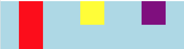
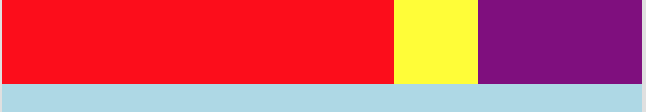
flex-grow: 它必须是一个整数,它表示如何分配剩余的空间,只越大他所分配的剩余空间就越大。
.children1 {
  width: 20rpx;
  flex-grow: 1;
  height: 100rpx;
  background-color: red;
}
.children2 {
  width: 100rpx;
  height: 100rpx;
  background-color: yellow;
}
.children3 {
  width: 100rpx;
  flex-grow: 2;
  height: 100rpx;
  background-color: purple;
}
-
flex-basis:属性定义了在分配多余空间之前,项目占据的主轴空间(main size),他可以是固定的宽度,也可以是百分比。
.children1 {
  height: 100rpx;
  flex-basis: 50%;
  background-color: red;
}
-
flex: 它是flex-grow, flex-shrink 和flex-basis的缩写。默认值为0 1 auto。
-
align-self:auto | flex-start | flex-end | center | baseline | stretch;表示单独一个Flex item的对其方式。
|