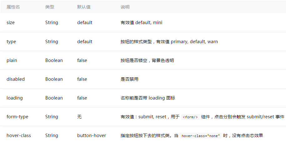
|
注:button-hover 默认为{background-color: rgba(0, 0, 0, 0.1); opacity: 0.7;}
示例代码:
/** wxss **/
/** 修改button默认的点击态样式类**/
.button-hover {
  background-color: red;
}
/** 添加自定义button点击态样式类**/
.other-button-hover {
  background-color: blur;
}
<button type="default" size="{{defaultSize}}" loading="{{loading}}" plain="{{plain}}"
        disabled="{{disabled}}" bindtap="default" hover-class="other-button-hover"> default </button>
<button type="primary" size="{{primarySize}}" loading="{{loading}}" plain="{{plain}}"
        disabled="{{disabled}}" bindtap="primary"> primary </button>
<button type="warn" size="{{warnSize}}" loading="{{loading}}" plain="{{plain}}"
        disabled="{{disabled}}" bindtap="warn"> warn </button>
<button bindtap="setDisabled">点击设置以上按钮disabled属性</button>
<button bindtap="setPlain">点击设置以上按钮plain属性</button>
<button bindtap="setLoading">点击设置以上按钮loading属性</button>
var types = ['default', 'primary', 'warn']
var pageObject = {
  data: {
    defaultSize: 'default',
    primarySize: 'default',
    warnSize: 'default',
    disabled: false,
    plain: false,
    loading: false
  },
  setDisabled: function(e) {
    this.setData({
      disabled: !this.data.disabled
    })
  },
  setPlain: function(e) {
    this.setData({
      plain: !this.data.plain
    })
  },
  setLoading: function(e) {
    this.setData({
      loading: !this.data.loading
    })
  }
}

for (var i = 0; i < types.length; ++i) {
  (function(type) {
    pageObject[type] = function(e) {
      var key = type + 'Size'
      var changedData = {}
      changedData[key] =
        this.data[key] === 'default' ? 'mini' : 'default'
      this.setData(changedData)
    }
  })(types[i])
}

Page(pageObject)
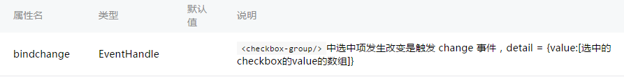
checkbox-group 多项选择器,内部由多个checkbox组成。
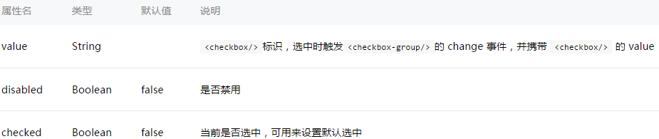
checkbox 多选项目
示例:
<checkbox-group bindchange="checkboxChange">
  <label class="checkbox" wx:for="{{items}}">
    <checkbox value="{{item.name}}" checked="{{item.checked}}"/>{{item.value}}
  </label>
</checkbox-group>
Page({
  data: {
    items: [
      {name: 'USA', value: '美国'},
      {name: 'CHN', value: '中国', checked: 'true'},
      {name: 'BRA', value: '巴西'},
      {name: 'JPN', value: '日本'},
      {name: 'ENG', value: '英国'},
      {name: 'TUR', value: '法国'},
    ]
  },
  checkboxChange: function(e) {
    console.log('checkbox发生change事件,携带value值为:', e.detail.value)
  }
})
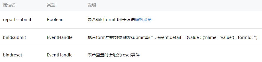
表单,将组件内的用户输入的<switch/> <input/> <checkbox/> <slider/> <radio/> <picker/> 提交。
示例代码:

<form bindsubmit="formSubmit" bindreset="formReset">
  <view class="section section_gap">
    <view class="section__title">switch</view>
    <switch name="switch"/>
  </view>
  <view class="section section_gap">
    <view class="section__title">slider</view>
    <slider name="slider" show-value ></slider>
  </view>

  <view class="section">
    <view class="section__title">input</view>
    <input name="input" placeholder="please input here" />
  </view>
  <view class="section section_gap">
    <view class="section__title">radio</view>
    <radio-group name="radio-group">
      <label><radio value="radio1"/>radio1</label>
      <label><radio value="radio2"/>radio2</label>
    </radio-group>
  </view>
  <view class="section section_gap">
    <view class="section__title">checkbox</view>
    <checkbox-group name="checkbox">
      <label><checkbox value="checkbox1"/>checkbox1</label>
      <label><checkbox value="checkbox2"/>checkbox2</label>
    </checkbox-group>
  </view>
  <view class="btn-area">
    <button formType="submit">Submit</button>
    <button formType="reset">Reset</button>
  </view>
</form>
Page({
  formSubmit: function(e) {
    console.log('form发生了submit事件,携带数据为:', e.detail.value)
  },
  formReset: function() {
    console.log('form发生了reset事件')
  }
})
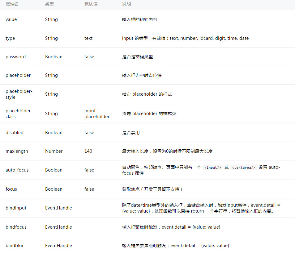
示例代码:
<!--input.wxml-->
<view class="section">
  <input placeholder="这是一个可以自动聚焦的input" auto-focus/>
</view>
<view class="section">
  <input placeholder="这个只有在按钮点击的时候才聚焦" focus="{{focus}}" />
  <view class="btn-area">
    <button bindtap="bindButtonTap">使得输入框获取焦点</button>
  </view>
</view>
<view class="section">
  <input  maxlength="10" placeholder="最大输入长度10" />
</view>
<view class="section">
  <view class="section__title">你输入的是:{{inputValue}}</view>
  <input  bindinput="bindKeyInput" placeholder="输入同步到view中"/>
</view>
<view class="section">
  <input  bindinput="bindReplaceInput" placeholder="连续的两个1会变成2" />
</view>
<view class="section">
  <input  bindinput="bindHideKeyboard" placeholder="输入123自动收起键盘" />
</view>
<view class="section">
  <input password type="number" />
</view>
<view class="section">
  <input password type="text" />
</view>
<view class="section">
  <input type="digit" placeholder="带小数点的数字键盘"/>
</view>
<view class="section">
  <input type="idcard" placeholder="身份证输入键盘"

                邀请
原作者: 模板之家
来自: 网络收集
| 


