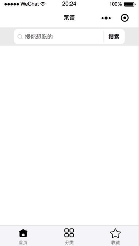
效果图

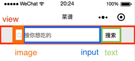
组件结构
为组件设置一个容器,在容器中放置搜索图标、输入框、清除文字按钮和搜索按钮。
<view class='container'>
    <view class='input-wrapper'>
        <image class='search-icon' src='/img/search.png'></image>
        <input
        placeholder='{{placeholder}}'
        value='{{inputValue}}'
        bindinput='handleInput'
        bindconfirm='handleSearch'
        bindfocus='inputFocused'>
        </input>
        <view class='close-icon-wrapper' wx:if="{{showCloseIcon}}" bindtap='clearValue'>
        <image class='close-icon' src='/img/close.png' ></image>
        </view>
        <text bindtap='onTap'>搜索</text>
    </view>
</view>
组件样式
container:高度 100 rpx,背景色 #eee,flex 布局。
input-wrapper:高度 80 rpx,背景色 #fff,flex 布局,border-radius: 20rpx。
search-icon:宽高 32 rpx。
input:字体和光标颜色 #000,字体大小 32 rpx。
close-icon-wrapper:宽高 80 rpx,绝对定位。
text:搜索按钮宽 110 rpx,高 65 rpx,绝对定位,左边框 2rpx solid #eee。
.container {
    background: #eee;
    height: 100rpx;
    width: 100%;
    display: flex;
    justify-content: center;
    align-items: center;
}

.input-wrapper {
    display: flex;
    align-items: center;
    height: 80rpx;
    width: 80%;
    background: #fff;
    border-radius: 20rpx;
}

.input-wrapper .search-icon {
    margin-left: 20rpx;
    width: 32rpx;
    height: 32rpx;
}

.input-wrapper input {
    margin-left: 10rpx;
    color: #000;
    font-size: 32rpx;
    caret-color: #000;
    width: 60%;
}

.input-wrapper .close-icon-wrapper{
    position: absolute;
    left: 480rpx;
    width: 80rpx;
    height: 80rpx;
    background:#fff;
    display: flex;
    justify-content: center;
    align-items: center;
}

.input-wrapper .close-icon {
    width: 42rpx;
    height: 42rpx;
}

.input-wrapper text {
    position: absolute;
    right: 80rpx;
    width: 110rpx;
    height: 65rpx;
    padding: 0;
    background: #fff;
    display: flex;
    justify-content: center;
    align-items: center;
    font-size: 32rpx;
    border-left: 2rpx solid #eee;
}
组件功能
1. 属性区分
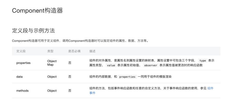
组件的构造器中要注意区分 properties 和 data,properties 中写组件的对外属性,data 写组件的对内属性。在本搜索组件中 placeholder 和 value 从页面传来,所以它们写在 properties 中,控制清除按钮是否出现的 showCloseIcon 要写在 data 中。
properties: {
    placeholder: {
        type: String,
        value: '搜索' // 如果页面不传placeholder,显示“搜索”
    },
    inputValue: {
        type: String
    }
},
data: {
    showCloseIcon: false,
},
2.方法设置
事件流程
(1)光标不聚焦,没有任何输入——显示搜索图标、placeholder和搜索按钮。
(2)光标聚焦,没有任何输入——光标闪烁,显示搜索图标、placeholder和搜索按钮。
(3)光标聚焦,有输入——光标闪烁,显示搜索图标、输入文字、清除按钮和搜索按钮。
(4)光标不聚焦,有输入——显示搜索图标、输入文字、清除按钮和搜索按钮。
(5)按回车搜索——清除按钮隐藏。
(6)点击搜索按钮——清除按钮隐藏。
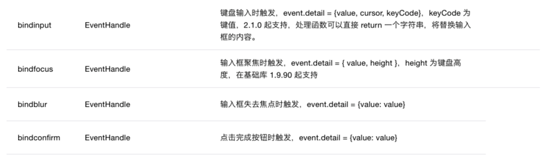
由此可见,需要 input 组件的聚焦和键盘输入事件。
<input
    placeholder='{{placeholder}}'
    value='{{inputValue}}'
    bindinput='handleInput'
    bindconfirm='handleSearch'
    bindfocus='inputFocused'>
</input>
inputFocused:如果聚焦时,输入框中有内容,显示 closeIcon;
handleInput:如果输入时没有内容,不显示 closeIcon,有内容,显示 closeIcon 并把值存入 value。
handleSearch:点击回车后,不显示 closeIcon。
triggerEvent:自定义组件触发事件时,需要使用 triggerEvent 方法,指定事件名、detail对象和事件选项。 文档详情
inputFocused(e) {
            if (e.detail.value !== '') {
                this.setData({
                    showCloseIcon: true,
                });
            }
        },
        handleInput(e) {
            if (e.detail.value == '') {
                this.setData({
                    showCloseIcon: false,
                });
            } else {
                this.setData({
                    showCloseIcon: true,
                });
                this.triggerEvent('handleInput', {
                    value: e.detail.value
                });
            }
        },
        handleSearch() { // 点击键盘上的回车,调用此方法
            this.setData({
                showCloseIcon: false,
            });
            console.log('handleSearch', this.data.inputValue);
        },
<view class='close-icon-wrapper' wx:if="{{showCloseIcon}}" bindtap='clearValue'>
    <image class='close-icon' src='/img/close.png' ></image>
</view>
<text bindtap='onTap'>搜索</text>
分别为 closeIcon 和 搜索按钮添加点击事件。
clearValue() {
            this.triggerEvent('handleInput', {
                value: ''
            });
            this.setData({
                showCloseIcon: false,
            });
        },
        onTap() {
            this.setData({
                showCloseIcon: false,
            });
            console.log('onTap', this.data.inputValue);
        },
组件 json
{
  "component":true
}
页面 json
工程的名字是 cookbook,这里组件前缀统一为 ck。
{
    "usingComponents":{
        "ck-input":"/components/search/index"
    }
}
页面 wxml
<view class='container'>
    <ck-input
    placeholder='搜你想吃的'
    inputValue="{{inputValue}}"
    bind:handleInput="handleInput">
    </ck-input>
</view>
页面 js
handleInput(e) {
        this.setData({
            inputValue: e.detail.value,
        });
    },
结束语
至此,搜索组件已完成初步开发。 |


